Cashflow
OCT’25-DEC’25
Finny Cashflow helps users understand their income, expenses, and savings surplus/deficit, forming the foundation for accurate FIRE (Financial Independence, Retire Early) projections.

Overview
Finny Cashflow helps users understand their income, expenses, and savings surplus/deficit, forming the foundation for accurate FIRE (Financial Independence, Retire Early) projections.
My Role
Led end-to-end design and strategy for the cashflow feature, translating user needs into a focused MVP with clearly defined functionality.
Problem
Most users lacked a clear understanding of:
Where their money was actually going
Whether they were saving enough—or leaking silently
How day-to-day behaviour impacted long-term FIRE outcomes
Without a reliable cashflow view:
FIRE projections became inaccurate
Users couldn’t identify what to optimise
Financial behaviour changes were unguided and reactive
The challenge was to make complex financial data instantly understandable—without overwhelming users.
Constraints & Complexity
Raw financial data was messy and inconsistent (banks, investments, transfers)
Users varied widely in financial literacy
Cashflow needed to work across individual, spouse, and family contexts
Insights had to be explainable, not just calculated
The system needed to scale as more data sources were added
Goal & Success Metrics
Primary goal:
Create a clear, trustworthy cashflow system that users could understand at a glance—and act on.
Success indicators:
User comprehension of surplus vs deficit
Reduction in confusion around spending and savings
Increased confidence in FIRE calculations
Engagement with breakdowns and trends
Key Insights
I orchestrated the entire user research process for this project, overseeing planning, recruitment, execution, and insight derivation. My objective was to delve into the goals, needs, and pain points of users as they navigate the realms of personal finance.
Totals alone don’t create understanding
Users needed structure—not just numbers.
Insights matters more than information
Seeing whether cashflow was “Excellent” or “Poor” was more actionable than exact decimals.
Users think in timeframes, not statements
Monthly, yearly, and recent views were critical for pattern recognition.
The Opportunity
“How might we create a simple and trustworthy cashflow experience that helps users understand their incoming, outgoing, surplus/deficit and improve their finances?”
The Solution
The research revealed three core user needs: structure over raw totals, actionable health signals over exact figures and timeframe-based pattern recognition.
The cashflow feature addresses these by breaking spending into categorised buckets, surfacing a simple Excellent/Reasonable/poor health indicator, and offering toggleable time views (monthly, yearly, average, total). Together, these create a weekly habit loop, users return to check their health score, drill into categories, and track progress directly driving WAU.
Clear primary signal: surplus vs deficit
The core view focused on one question:
"Is my cashflow healthy right now?"
Incoming vs outgoing clearly separated
Net surplus/deficit highlighted as the primary outcome
Removed secondary details from the first glance
This reduced cognitive load and anchored interpretation
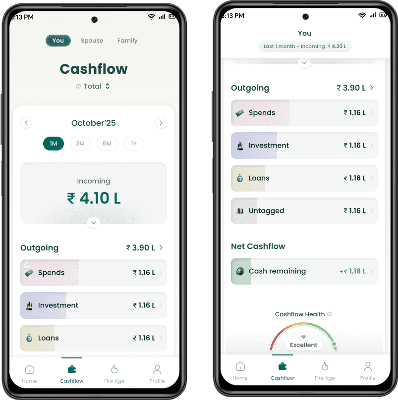
Time-aware cashflow views
To support different mental models, users could switch between:
Monthly averages
Yearly averages
Specific months
This allowed users to identify:
Short-term anomalies
Long-term trends
Behavioural drift over time
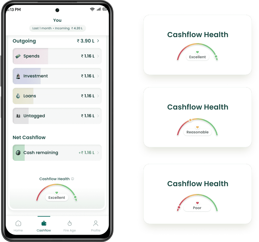
Health indicators instead of raw judgement
Introduced Cashflow Health states:
Excellent
Reasonable
Poor
These translated complex calculations into human-readable feedback, helping users self-assess without feeling judged.
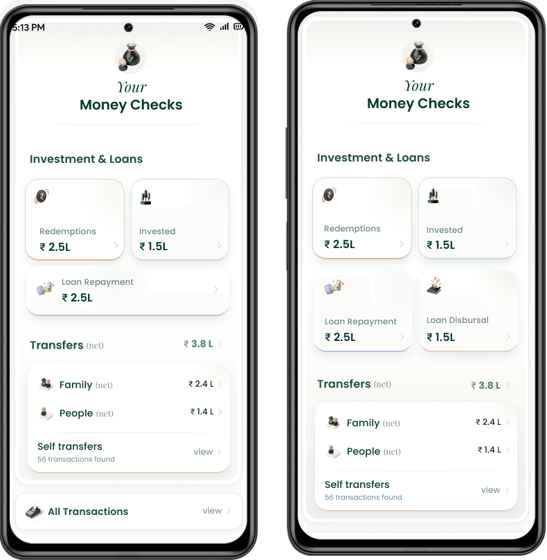
Money Checks: explain the “why”
To prevent confusion and mistrust:
Added Money Checks that surfaced transfers, loans, investments, and redemptions
Explicitly called out self-transfers and family transactions
Reduced the “where did my money go?” anxiety
This layer built trust in the system’s accuracy.
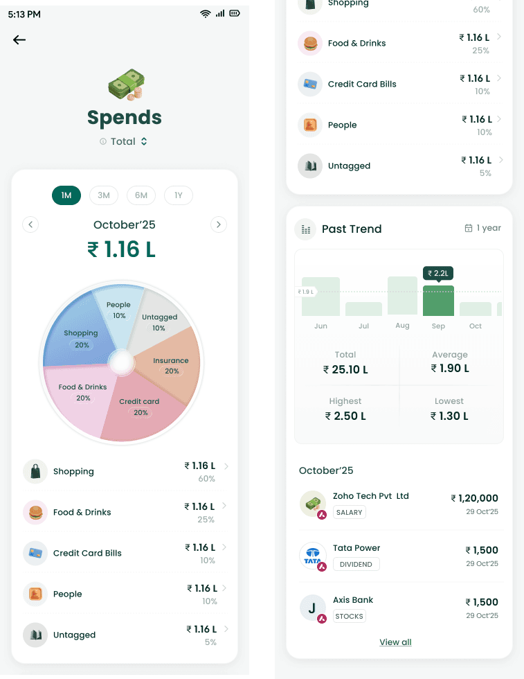
Category system with drill-down depth
Designed interactive category cards:
Spending split by category with percentage and amount
Drill-down to individual transactions
Merchant-level visibility with dates and amounts
Added trend views:
Month-over-month
Year-over-year
Average benchmarks
This enabled users to move from awareness → diagnosis → action.
Systems Thinking & Scalability
The Cashflow system was designed to:
Support future data sources (PF, insurance, vehicles)
Extend across individual, spouse, and family views
Feed clean, explainable inputs into FIRE calculations
Scale from MVP to full advisory platform
The Impact
Users gained immediate clarity on their financial position
Cashflow became the most referenced screen when discussing FIRE readiness
Reduced confusion around savings and spending patterns
Strengthened trust in Finny’s advisory recommendations
Qualitative feedback highlighted:
“This finally makes my money make sense”
“I know exactly where I’m off-track now”